Japanese candlesticks for beginners: how to read and analyze correctly
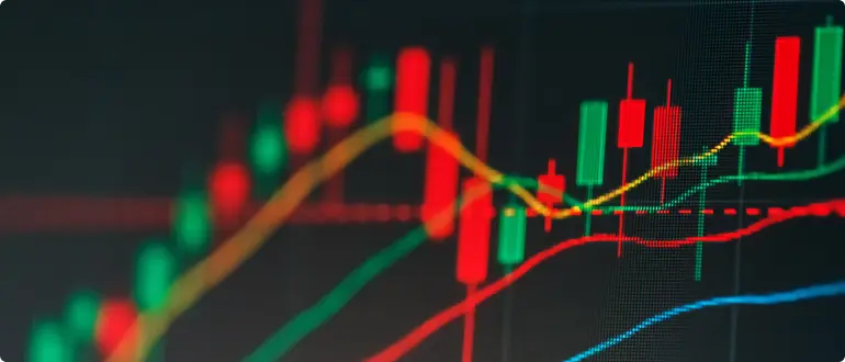
Table of Contents
- What are Japanese candles in simple words?
- What do Japanese candlesticks show on a chart?
- How do you read Japanese candlesticks?
- Japanese candle color
- Japanese candle structure
- Candle body
- The mood of the candle
- The shadow of a candle, or the tail of a candle.
- Japanese candlestick combinations
- Doji
- Examples of trading
- Conclusion
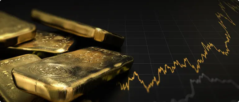
Online trading starts with the price chart. Of course, first you have to choose a broker, then download a trading platform, and when you open it and get ready to trade, the first thing that will catch your eye is the price chart. Each asset has its own chart, no two charts are absolutely identical.
Yes, indeed, it would be more logical to show how the price changes over time using a line. A new quote would be received by the online platform and "inserted" into the chart in the form of a new point. As a result, you would have a broken line in front of your eyes, which connects all these quotes to each other.
There is also such a way of display, it is called Linear, but traders all over the world have recognized the most convenient and informative type of Japanese candlesticks.
What are Japanese candles in simple words?
Japanese candlesticks are, in fact, a display of grouped quotes coming to the platform for a certain period of time (time frame). For example, on a five-minute timeframe each candle is data on price changes for the last 5 minutes, and on an hourly timeframe - for 60 minutes. Thus, traders can choose a period and focus on a particular candle to understand exactly how the price behaved at that time.
Japanese candlesticks themselves can serve as a method of market analysis. In trading terminology it is called Price Action, when a trader makes a decision to open a deal based only on how the price has moved before. In fact, Japanese candlesticks are the basis of graphical analysis in the markets.
What do Japanese candlesticks show on a chart?
Each candlestick as such carries quite a lot of useful information for a trader. In addition, candlesticks can be formed into special figures as the price changes. No, of course, you will not see a square or a circle on the chart, but "steps" in the form of a flag or "angles" up and down in the form of a double or triple top are quite possible. Such figures are called patterns. Their essence is that visually displaying a certain behavior on the chart, the price further behaves predictably - as it used to behave in a similar situation before (a week, a month, years ago).
Knowing these patterns and knowing how to determine what figures Japanese candlesticks form on the chart, traders can make much more accurate forecasts than those of their colleagues who prefer not to study the market situation closely.
How do you read Japanese candlesticks?
As we have already written above, each candle carries certain information about the behavior of quotes for the period you have chosen. The scale can be up to one minute (M1). However, it is hardly suitable for serious analytics - there is too much probability to observe market "noise" instead of a real trend.
By the way, market "noise" is price fluctuations that are caused only by the momentary supply and demand on the market and have nothing to do with the real reaction of quotes to news or other notable events. The larger the timeframe, the less influence of such "noise" on the visual trend.
If you open, say, a weekly period (W1), you will be able to detect quite specific trends on your own. If you see that visually the price chart is mainly heading upwards, then you are facing a long-term (or medium-term) uptrend. If the chart is going down, you are facing a downtrend. But an uncertain direction for some time may indicate a sideways trend, i.e. flat.
Of course, you should not determine trends by eye in real trading. Use indicators for this purpose: Trend Lines, SMA Moving Average and others. You will find such help lines on your trading platform in the tools section, and they will help you read charts more confidently and correctly.
Japanese candle color
First of all, each candle has one of two colors: usually red (descending) and green (ascending), but depending on your settings and personal preferences can vary.
A green candlestick indicates that the price has been rising in that particular time frame, while a red candlestick signals that the price has been falling. Accordingly, if you look at the chart and see that there are more green candles than red candles, and they are obviously longer, it may well be that you are observing an uptrend. On the other hand, a large number of red "bars" is very likely to be on the chart of a downtrend.
If you have a black and white version of the quotes chart in front of you, which is also not uncommon, then white candlesticks help you quickly determine that the quotes are going up, while black candlesticks show that the price is heading down.
Japanese candle structure
Now look at each candle more closely: you can zoom in on the chart to do this. You will see that not only the color is different, but also their length, as well as the tails above and below each candle. All these elements carry important data that you can use for your own analytics and forecasts about the continuation or change of the current trend.
So, the candlestick rectangle itself is its "body", and the dashes on the top and bottom (or only on one side) are the so-called "shadows" or "tails".
What can be understood by looking at this Japanese candlestick? Traders use it to determine the quote at which trading started during this period (Open value). It is also possible to understand at what quote the trading ended (Close), what level the chart reached the maximum during this time (High) and to what mark the price fell (Low). I.e. you can collect basic data: maximum, minimum and average value for the period.
Candle body
Depending on which quote was higher - opening or closing - the color of the candle body appears. If the closing price was higher than the opening price, it means that the value of the asset has increased during the selected period and the Japanese candlestick will be colored green (white). If the closing price is lower than the opening price, the candle will be colored red (black).
It can often be observed that the body of the candlestick shows both maximum and minimum price values at the same time, i.e. there are no shadows. This happens, for example, during the period of sideways movement, flat, when the chart does not make sharp movements and the opening-closing prices are peaks in themselves.
Shadows can also be absent in a diametrically opposite situation: when we are facing a strong trend and the price is rapidly rising or rapidly falling. Most likely, then the body length of each next candle will be higher/lower and longer than the previous one.
It also happens that the quote changes sharply between time periods. So sharply that a new candle has not yet had time to start forming. Then we will no longer see a "body" on the chart, which will fix this change. We will see a gap, which is called a gap. I.e. the opening level of the next candle turns out to be much higher or lower than the previous one.
The mood of the candle
Traders look at the market situation according to Japanese candlesticks. They call green candlesticks - those that show growth - bullish candlesticks. Red candlesticks have the slang name of bearish candlesticks. According to what candlesticks are more on the charts today, the whole market is called.
For example, if the prices of most currencies are rising and we see that green candles prevail on the charts of different pairs, it means that the market of a currency pair is bullish.
This is also true, for example, for the U.S. stock market. When you hear in the news that "the market is in the red zone", it means that bearish candles are dominating the charts of indices and stocks of individual US companies.
Thus, it is the candlestick sentiment that forms the visual uptrend or downtrend. There are many trend indicators and systems. At the same time, some traders (and there are many of them) prefer to trade against the movement: such strategies are called counter-trend. There are also tactics of trading inside the channel. For example, during the sideways movement of the chart, when green and red candles are approximately equal in number and they are approximately the same height.
Japanese candlesticks in such strategies create a trading signal by themselves. It can occur when the chart reaches a horizontal support or resistance level, breaks it, and then a new candle starts to form above the level. Potentially, the quotes will continue to go up.
The special secret of this strategy is in the competent placement of levels: some analysts recommend to place them along the upper and lower boundaries of two or three highest and lowest candles of the period. Others are of the opinion that the range boundaries (horizontal lines) should be drawn along the shadows (tails) of Japanese candlesticks. It is difficult to say which of them is really right. It is optimal if you check both one and the other theory on a demo account. Make your own conclusions, because a visual trading result is always better than someone else's theories.
The shadow of a candle, or the tail of a candle.
It is curious that even watching the formation of the candle for the entire period of the time frame (for example, all 5 minutes), you will not be able to say for sure until the last one, in what color it will be colored after closing.
A candlestick can easily change color, lose its body completely (when the current quote suddenly coincides with the opening price), and draw long tails up and down at the end. You will not see these shadows until the period is completely over. Only when the 5 minutes expire completely, it will be possible to accurately say to what maximum and minimum mark the price of the asset reached at that time.
There are trading strategies that are just based on analyzing the length of tails and the size of candlestick bodies. For example, some traders, if they observe that the lower shadows are getting longer and the upper shadows are getting shorter, decide that the price is trying to go down, and now there are all the prerequisites for a downtrend. The same is true for the upper shadows. At the same time, the actual length of the tail demonstrates the strength of the bounce from the support or resistance level.
However, we want to warn novice traders: initially remember that there are no strategies that would predict a trend reversal with 100% probability. After all, as you understand, each candle shows only past price data and cannot predict the future.
However, a trend reversal can still be seen with an increased probability, as well as the continuation of the trend. Special combinations of Japanese candlesticks help analysts in this.
Japanese candlestick combinations
We have already mentioned above about patterns, these are the figures into which candlesticks are formed on the chart at the moments when the price tries to reach the target, or "cannot" move further and turns around, or "freezes for a while in indecision", and then still continues its way in the chosen direction. The most interesting ones are "Flag", "Head and Shoulders", "Double Top" and "Double Bottom". There is also an interesting but rare figure "Diamond". The names are beautiful, but it is not easy to recognize such figures in the market, especially for an inexperienced trader.
There are patterns of a different kind - less complex and more common. They are candlestick shapes and combinations that you can find on asset charts yourself with an unarmed eye, all you need to do is open any online platform.
The logic is simple: when there are more people in the market who want to buy an asset, according to the law of supply and demand, the price starts to rise. Along with it, the confidence (length) and the number of green candles grows. If suddenly there are two or three candles without a body (not colored), it may mean that at this level the interests of buyers and sellers are equal. That is, the strength of those traders who wanted to buy the currency pair has dried up, and their number has equalized with the sellers.
To notice such candles in time means to get a signal either for a decisive reversal of the trend, or for the appearance of new buyers and the continuation of the trend. By the way, it happens very rarely, more often a potential reversal will be in front of you at this moment.
The combination of candlesticks with the lower shadow much longer than the upper one is called a pin bar combination. Analyzing this situation, we can understand that the sellers-bears tried to reduce the price of the asset, but the buyers-bulls had more strength in this particular period. This may indicate the strengthening of the uptrend.
Conversely, long tails up and confident red candlestick bodies will be called pin bars on the downside and illustrate the strengthening of the downtrend.
Doji
Another common candlestick shape that can make up a balancing combination is candlesticks with equally long tails. If you see such candles, it means that there is a balance between bears and bulls in the market. If the body of the candlestick is also extremely small, then you are looking at a so-called doji, a type of balance candlestick.
The shadow tails in the case of the doji are not as important as the characteristics of its body. Thus, if the doji is small and black, it means that the closing price of the period is only slightly less than the opening price. A small and white one signals that the closing price is higher than the opening price.
And the complete absence of a body - yes, it happens - indicates that the opening price is equal to the closing price. Such a flat doji is considered ideal, canonical, and "colored" dojis on its background do not have such significance from the point of view of analytics.
But let's get back to its tails. They themselves also carry certain information that can be used in analyzing the market:
- Thus, if the shadows are the same, it means that the market is not so much in balance and harmony as in uncertainty. After all, there is no specific trend at the current moment, and the forces of sellers and buyers are equal.
- If the shadows are short, most likely, the market is now concentrating before a jump in one direction or another. Even if shadows differ in length, it is not a clue about further market movement. Rather, it indicates whose attempts - sellers or buyers - were more decisive in this particular period. However, since we are talking about dojis, at the end of the period they did not lead to anything anyway.
Of course, you should not consider the doji candle separately from the chart context and neighboring candles. So, if a "flat candle" appeared sharply after a long green candle, it means that we can expect a downward reversal soon, or at least a market halt in indecision. Look for explanations in the next candle. If it is long and red, it means that you have really hit the moment of chart reversal. If a gap down is suddenly formed, then, in all likelihood, the bears' pressure is now too great, and the trend is reversing.
When you start to study Price Action analysis more closely, you will learn many interesting candlestick combinations and patterns, including those involving dojis. Traders like to give them unusual names. For example, a doji without a lower tail, but with a long upper tail is called a "Grave", and only one long tail downwards says that you are looking at a "Dragonfly".
Examples of trading
When you start trading with Japanese candlesticks and patterns, it will immediately seem that you need to keep a lot of information in your head: visual candlestick patterns, rules of signals (after a long candle, after a short candle, after a doji), etc...
In fact, everything is not so terrible: with experience you will understand how the market reacts to these or those rules described in this article or suggested in the free training on the FxPro website.
The first thing you need to do is to learn how to plot trend lines on a chart, they are sloping and follow the chart. But support and resistance levels are usually horizontal, the chart breaks them up and down. Many technical analysis strategies are based on the breakout or rebound from such levels.
To make it easier for you to analyze the behavior of Japanese candlesticks, we recommend stretching the Fibonacci grid on the chart. Of course, this also requires precision, but when you learn how to overlay this indicator on the key points of the current chart, you will understand why Japanese candlesticks are much more convenient than Linear display.
Conclusion
Still, analytics works much better in a complex of methods. After all, traders on the other side of the ocean are looking at the exact same candlestick chart with the exact same support and resistance levels at the same time as you. And you, when you gain practical experience, will be able to roughly imagine what potential actions they may be taking now.
We are already talking about crowd psychology: after all, buyers and sellers in the market are human beings. The color of the next candle depends on them and their decisions. It turns out that it depends on them which way the chart will go next and which trend it will form.
Therefore, when you start trading, it makes sense not only to focus on looking at each individual candlestick and searching for patterns, but also to understand the economic and political context in which market events are currently taking place. This way you will have a better understanding of what to expect, and you will be able to justify the events that are visually formed into candlestick patterns.
Shares or Oil?
available to trade!